Gotham Typeface Analysis
I did not make Gotham Typeface, but I did study it in thorough detail:
Gotham is distinct as a font because of its incredibly geometric integrity. The origins of the font regard a story of developing New York City engineers (not designers) who wanted the most frugal but effective way to show lettering when constructing buildings. The result was a rational, sans-serif type that was later vectored by Hoefler & Co.
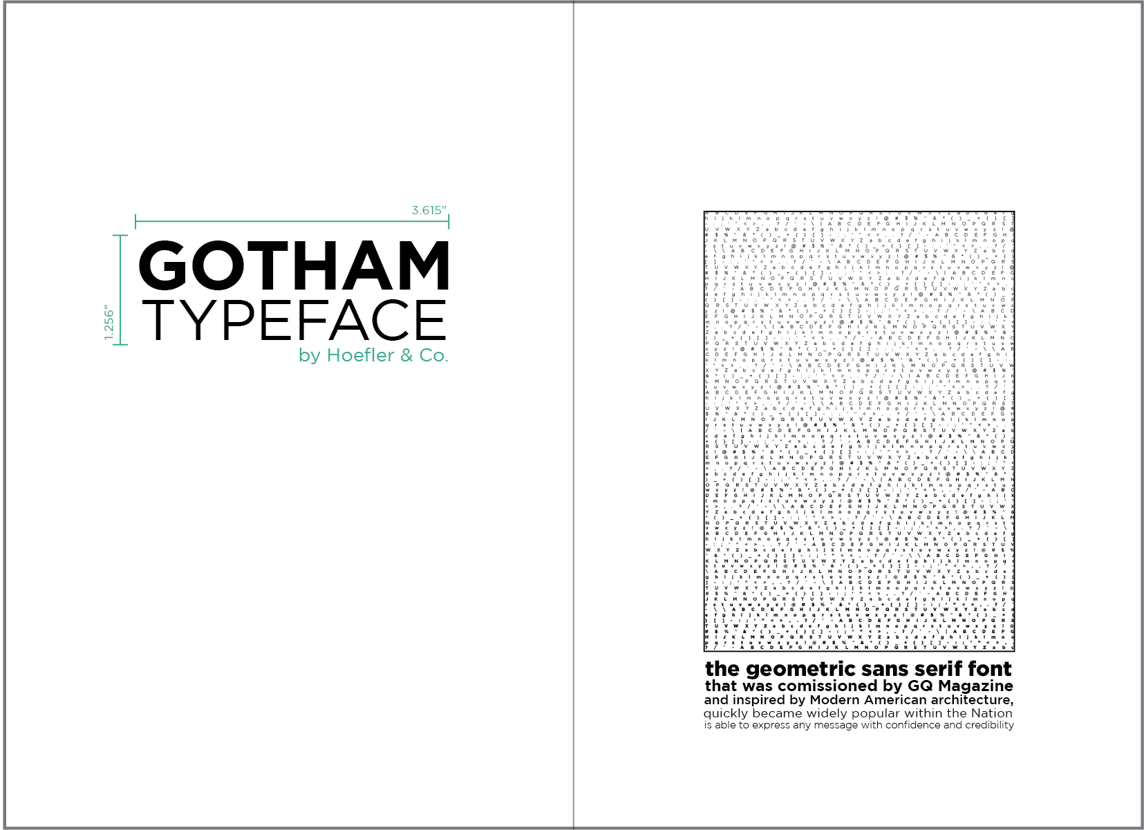
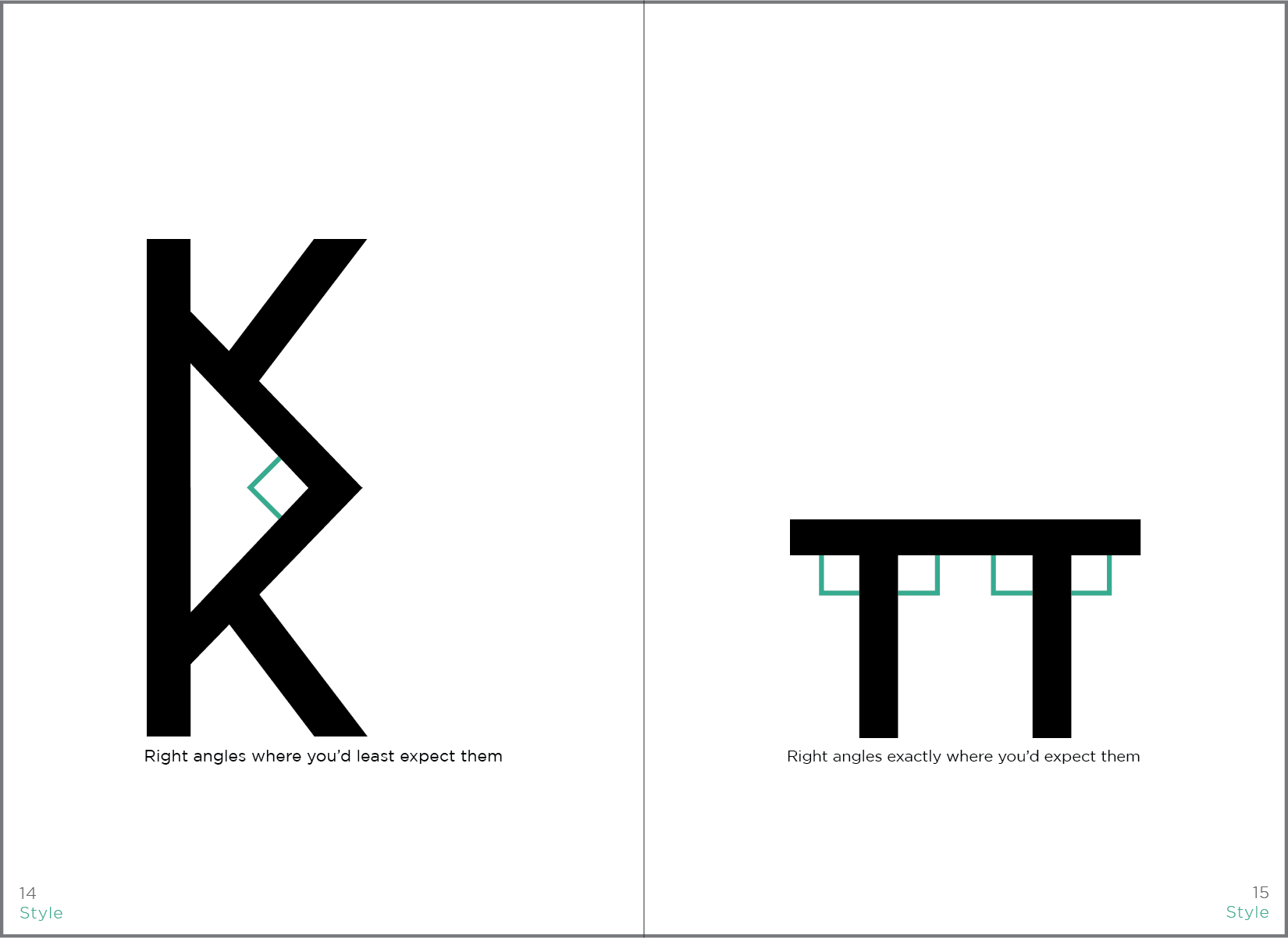
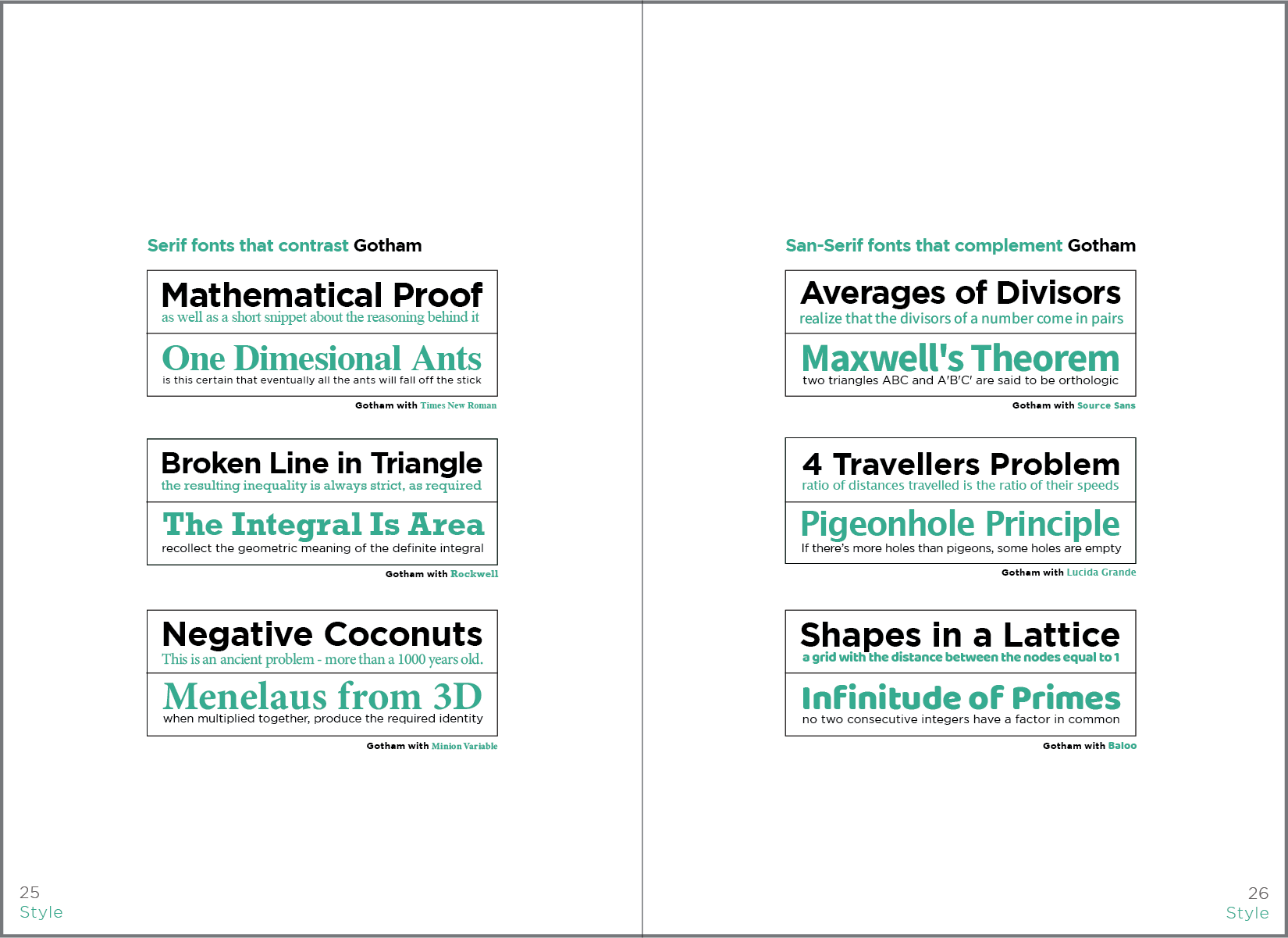
A type specimen book was created to feature the font’s characteristics, origins, complementary font pairings, similar typography, and much more.
As a fun way to demonstrate mathematical precision in Gotham’s typography, the letter L can also be used as a right-angle ruler
Advertising posters using the 3D letterform L were created to show the font’s solid and conservative integrity.
Alternative representations of Gotham included a blueprint color and aesthetic.


